Orders of magnitude: governing signals during COVID-19
As the scale of the pandemic reaches over 4.5 million cases, how and when are governments responding? What can data tell us about the different policies enacted around the world?
Staying up to date with breaking news about the pandemic is a tiresome task. Even more, what to do with all that information? Data visualizations have become a bigger part of popular culture, as a plethora of resources made available by institutions like John Hopkins University and Our World in Data help the world stay informed and adopt data-driven mantras such as "flatten the curve." In recent months, researchers around the world have mobilized quickly to collect various information resources and data related to various concerns raised by COVID-19.
Watching as these datasets are collected presents an interesting opportunity to see how data modeling decisions may influence our understanding of the pandemic for years to come. Text-rich datasets of government responses and policy measures not only provide a useful mechanism for feeding user-friendly databases and avoiding news-overload, but also present a valuable tool for researchers looking to compare responses across countries and assess what constitutes good governance during a crisis. Below are a few of the datasets I've been watching most closely, and am beginning to see pop up in public Tableau dashabords.
A few of the datasets being compiled on government policy responses
| Organization | Dataset | Details |
|---|---|---|
| ACAPS | #COVID19 Government Measures Dataset | 7K+ government measures, incl. categories: Social Distancing, Movement Restrictions, Public Health Measures, Social and Economic Measures, and Lockdowns |
| Blavatnik School of Government, Univ. of Oxford | Oxford COVID-19 Government Response Tracker (OxCGRT) | Collection of publicly available information on 17 indicators of government responses, incl. containment and closure policies, economic policies, and health system policies |
| CoronaNet Research Project | Tracking government responses towards COVID-19 |
10K+ separate policy announcements from governments across 19 categories incl. closures, restrictions of gatherings and borders, and anti-disinformation measures |
| World Health Organization | Tracking Public Health and Social Measures | Collation of datasets collected by WHO, the London School of Hygiene and Tropical Medicine, ACAPS, University of Oxford, US Centers for Disease Control and Prevention and the Complexity Science Hub Vienna, using a common taxonomy and structure, into a single, open-content dataset for public use. |
When is the right time to act?
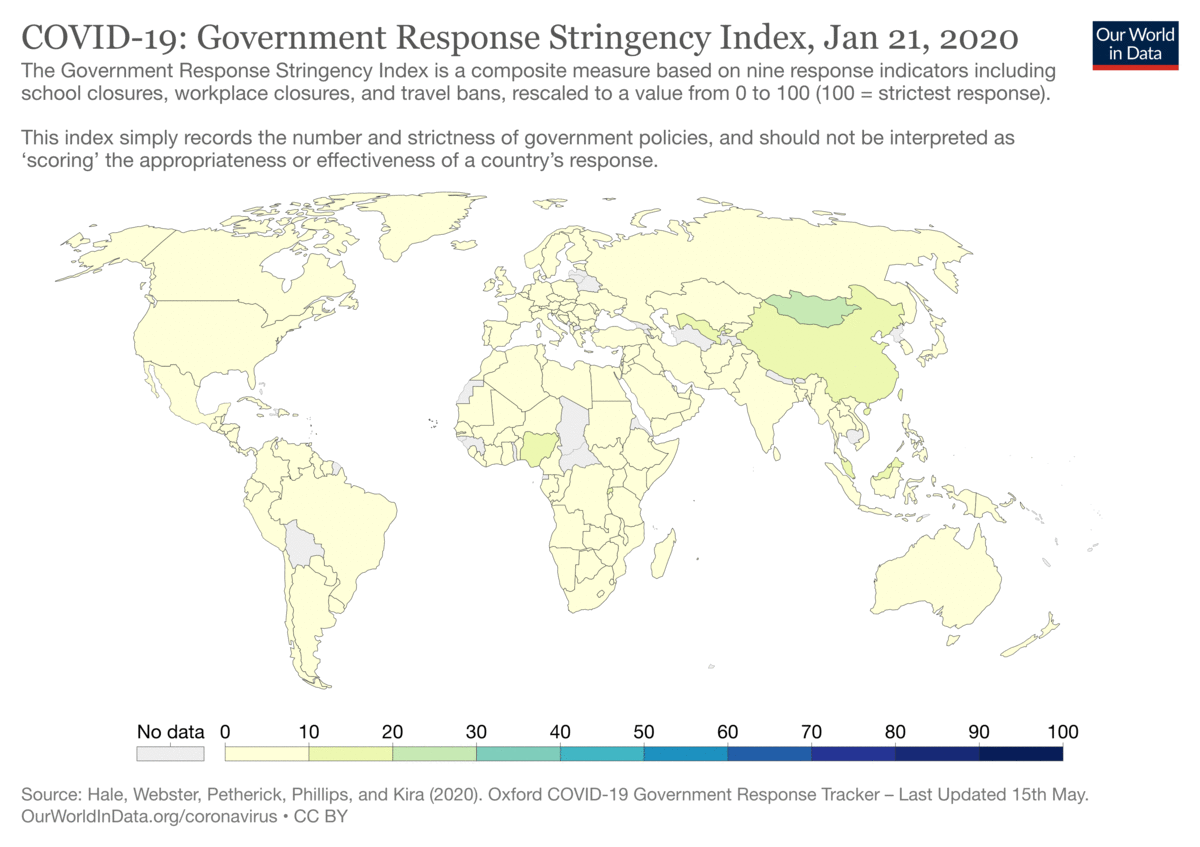
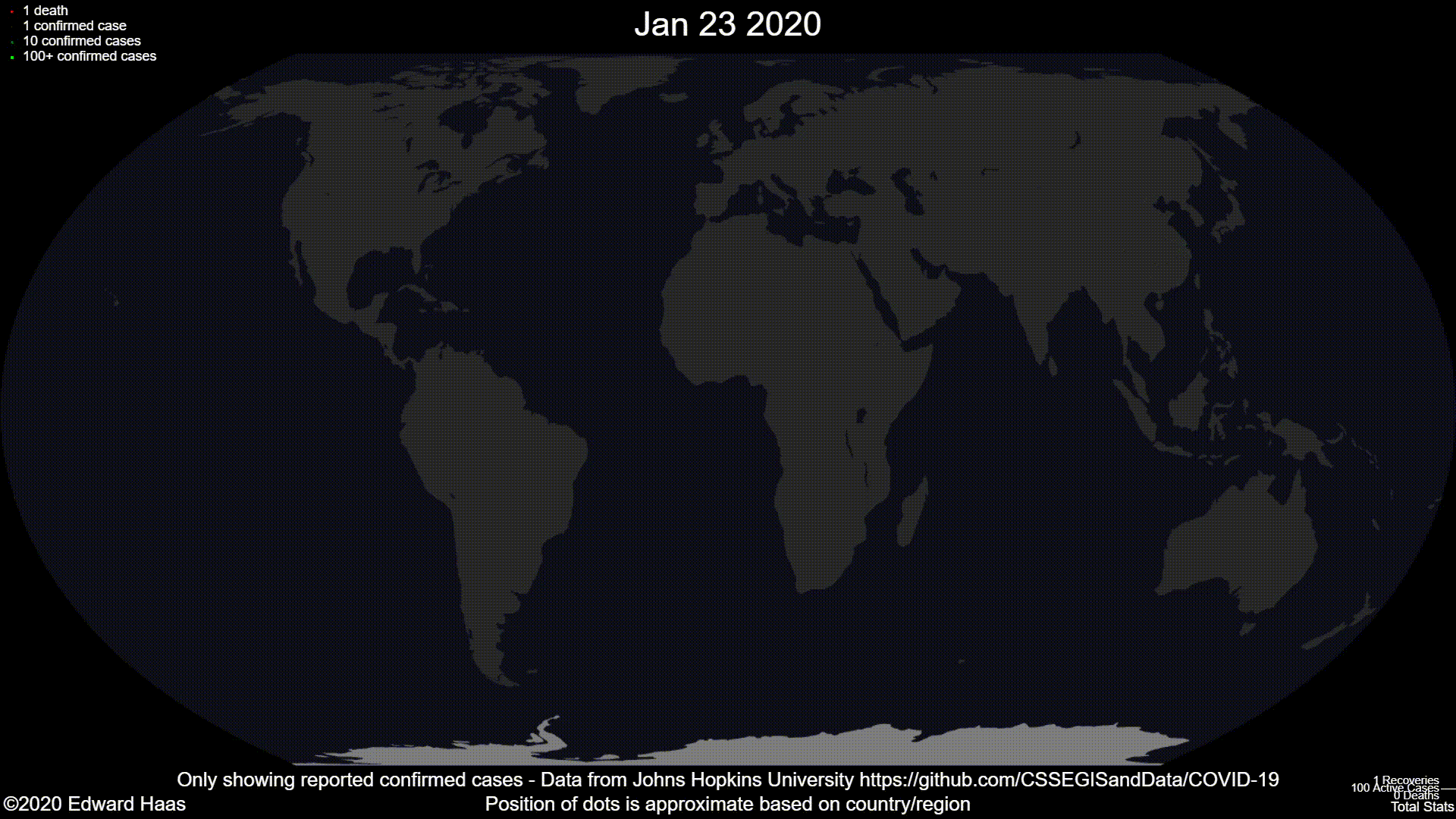
This visualization above from the OxCGRT dataset shows the seriousness of the pandemic sweeping across the globe month by month from January to May. Daily activations or easing of policies is being captured by University of Oxford researchers through a Stringency Index that records the number and strictness of policies. The measure is neither an evaluative measure of effectiveness or proactivity, nor an indicator of "good" or "bad" reponses by governments. Seeing it visualized on the map, htough, does reflect the experience of living through the pandemic over the last few months. The world has become and continues to be on high-alert. Contestations of stringent government measures exacerbate local social and political strife; the restriction of mass gatherings inhibits social movements but sparks outcry possibly generating. A kind of cosmopolitan envy spreads as people try to make certain nation's repsonses exemplars: Sweden's lax measures are praised by the American Right, governments successful in implementing contact tracing apps such those in South Korea and Singapore demonstrate tech-for-good. In this anxious climate, criticism of local responses carries the weight of global geopolitics, and pundits and prognosticators eagerly weigh in on how perceived sucesses and faillings signal shifts in the global competition for credibility and status between liberal democracies and alternate forms of governance. All the while, the virus continues its spread and we wonder when, if ever, this all will end and how the world will change.
Experiencing all this, I wonder how is it possible to judge when is (or, was) the right time for governments to act? And further, what significance did the variety of signals governments were receiving as time went on -- the increasing cases and deaths, allies' declaring national emergencies,
massive labor layoffs and migrations, negative oil prices -- have on their propensity to act? For scholars across discplines such as political science, behavioral ecology, and economics, these questions
might be understood through the lens of signal theories. Signalling theories vary between disciplines, but the basic question remains largely the same: how do actors evaluate information to be able to make decisions whilst knowing those decisions convey information that will influence the decision making of others?
I decided to make some visualizations that can help ask questions driven by this line of questioning, and in doing so realized how many dimensions of available data encode the pandemic's yet-to-be-fully-comprehended time scales.
The animations featured above showed different aspects of change brought about over the last several months by the pandemic: the growing magnitude of cases and deaths, and a wave of panic accompanying more stringent orders by governments.
For my own efforts, I attempted to reckon with the fact that all across the world, countries are essentially caught in different (though obviously interconnected) timelines. And while local contexts and challenges will surely affect just how these timelines pan out, a handful of nations may be able to benefit from a kind of pre-emptive preparedness brought by others' arrival on the other side of the curve and the measures that brougt them there.
Swarms of proactive and reactive measures
To interpret the various signals they were receiving about the scale of the global outbreak, governments relied on various sources of information and epidemiological models, comparing the data on the virus's spread elsewhere with the spread locally to judge what policies might be enacted. What can be gained from viewing time in terms of these global and local signals, rather than through an absolute calendrical timeline of events? Which countries enacted policies proactively, before the first local case, and which enacted policies reactively, in the weeks afters the first cases?
Shown here are the unique new entries for policies in the CoronaNet Project dataset. Hover over to read a description of the announcement, including when the policy started and how many national and global cases and deaths there were at the time. Use the slider to filter national policies by the scale of global confirmed cases when a given national policy/measure began. Darker red dots indicate there were relatively more local cases at the time the policy began.
Many more lockdown and quarantine orders were issued pre-emptively than full-on restrictions of mass gatherings. By filtering the global cases slider to see what policies began prior to the global outbreak reaching 100k cases, you'll notice that the most pre-emptive restrictions of mass gatherings were made by Mongolia and Myanmar -- close neighbors to China. Selecting United States from the countries dropdown offers a look into what U.S. states issued lockdown orders or restricted mass gatherings. Notice that all such measures were made months after cases had already appeared in the U.S.
External borders have been closed around the world, restricting global travel and business between nations. It seems that internal borders have been closed less frequently, with most restrictions being announced only after outbreaks had already begun.
To my awareness, the CoronaNet Research Project is the only government policies dataset that includes anti-disinformation related responses in the data model. Still, it appears that much of the data has yet to be gathered. The panemic only highlights how disinformation has increasingly become a concern across the globe. How might a proliferation of disinformation threaten the efficacy of policy measures? Public awareness campaigns have been an important part of government responses around the world. What constitutes fair use of data has implications for the kinds of public signalling that will be permitted to dictate orders; a curious example is Montenegro's announcement just as cases began that names and personal data of people in self-quarantine would be published on a government website. Exploring the description of these events offers details into local concerns, trade-offs and admonitions, partnerships with religious communities, municipalities and school districts and international organizations. How these measures develop and become the new normal remains to be seen.
What happens next?
Events are still unfolding, data is still being generated and data models are being worked and re-worked in real-time. What measures prove effective, whether proactive or not, will be a contentious issue in the policy debates in the months and years to come -- and can only be decided as time passess. Making sense of the troves of data that are currently being collected will be a years long task for concerned citizens and technologists, policy makers and social scientists and will affect the theories and models of governance birthed out of the 2020s. As re-opening policies are announced and mobility increases, perhaps there will be additional ways to view the translation of epidemiological and environment data into signals for policy making and social life.